I pulled images from the following sites:
Tuesday, December 2, 2008
Composite Landscape
Scanning Project
This is the scanning project. I'm actually quite pleased with the way it turned out. I like that the colors all sort of work with each other. The reason some of the fruit is in a bag is because I didn't want it to leak on the scanner. I was leery of how this would look: I didn't want it to come off as trashy, but I think in the end, it actually added some interest.
Sunday, November 2, 2008
Retouching Photos
Tuesday, October 28, 2008
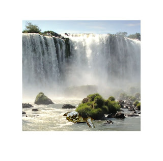
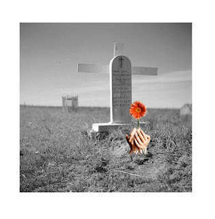
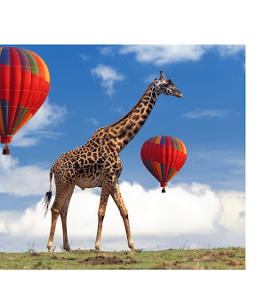
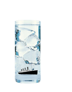
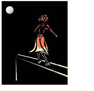
Icons in Photoshop
I honestly had a blast doing this. I found it to be a lot of fun once I became used to the new tools. It's strange--a lot of them do the same thing as illustrator tools, but they work in different ways. I'm really excited to start our next project- a compilation/landscape of different pictures using this technique.
Images taken from:
http://www.starway.org/Titanic/pictures/Titanic%20BW.gif
http://www.news.ucdavis.edu/photos_images/news_images/02-2006/water_ice_lg.jpg
http://www.giraffes.org/giraffe-01.jpg
http://thefuntimesguide.com/images/blogs/colorful_hot_air_balloon.jpg
http://botit.botany.wisc.edu/images/veg/Barrens/Ornate_box_turtle_VK.low.jpg
http://www.archives.gov.on.ca/english/interloan/big/pics/0457_grave_of_moses_bluecoa.jpg
http://images.inmagine.com/img/corbis/crb274/crb274034.jpg
http://www.travelblog.org/Wallpaper/pix/waterfall_desktop_background-1600x1200.jpg
http://newsrawnews.files.wordpress.com/2008/04/great-white-shark-picture-014.jpg
http://www.aquamanagers.com/assets/toilet-installed.jpg
Tuesday, October 21, 2008
Memoir in Photoshop
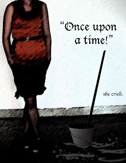
We just began working with photoshop this week! Much of it is the same as illustrator, but it seem much softer. I really like it so far. The first picture is one with a filter, and the second is without. I like the higher contrast on the filter one, but don't know how to change it on the other one. For some reason, my background split into two layers, and I need to fix that and unlock them both before I can edit the contrast.
Monday, October 6, 2008
Degas Imitation
Edgar Degas was a French artist who lived from 1834-1917. He is often classified as an impressionistic artist, but he worked in many styles, ranging from romanticism to realism to classical. His work was set apart from the other impressionists because while they often focused on nature, Degas enjoyed people. A few of his favorite subjects to draw and paint were jockeys and bathers, but the subjects he is most well know for are his dancers.
For this assignment, we were asked to create a self-portrait in the style of a well-known painter. I chose Degas because I love his color choices (whites, creams, and pinks with browns and greens and purples) and his impressionist style: some looser strokes, mixed with more solid lines. This was fun!
Sunday, September 28, 2008
My Self Portrait
Tuesday, September 23, 2008
Symbols
Thursday, September 18, 2008
Illustrator Family
Tuesday, September 16, 2008
It was both fun and frustrating trying to put this memoir together. I think the font fits wonderfully, and I like the overall idea of the composition, but I truly don't feel like the actual picture works all that well. I'd love to rework it at some point in time on my own terms. I'm sure the quality of the vector images would improve immensly after I've learned more about illustrator as well.
Friday, September 12, 2008
Thursday, September 4, 2008
Subscribe to:
Posts (Atom)